This project was complete for Package Design Class. The concept is based around an unusual cocktail from Dawson City, Canada. The legend goes that two rum-runner brothers were bootlegging across Canada when one brother developed frostbite on his toe. In an act of desperation the other brother cut off his toe and preserved in a mason jar of bourbon. Modern day at the gold rush era inspired, Sourdough Saloon, you can order a shot with a genuine human toe in it. This version imagines the drink as a bourbon cola drink with a hard candy toe int he bottom as a nod to the tradition and legendary story with imagery inspired by Yukon Canada, bootlegging, the gold rush, and the gruesome toe drink.
SOURTOE
Package Design, Branding

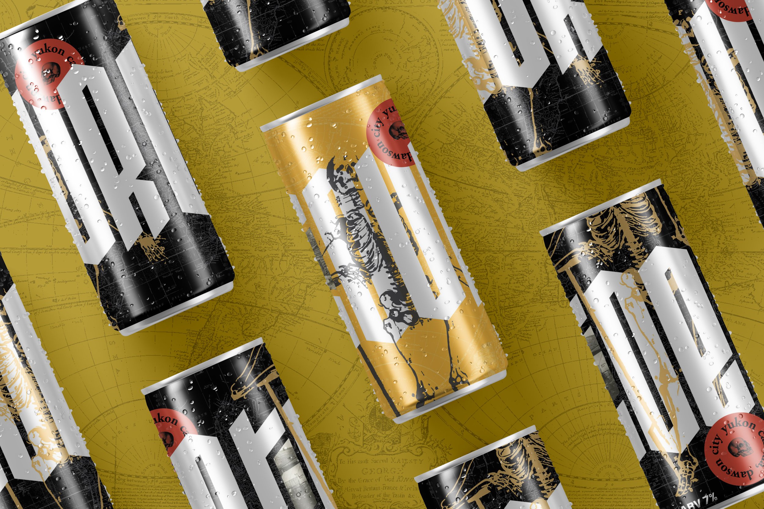


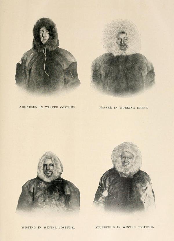
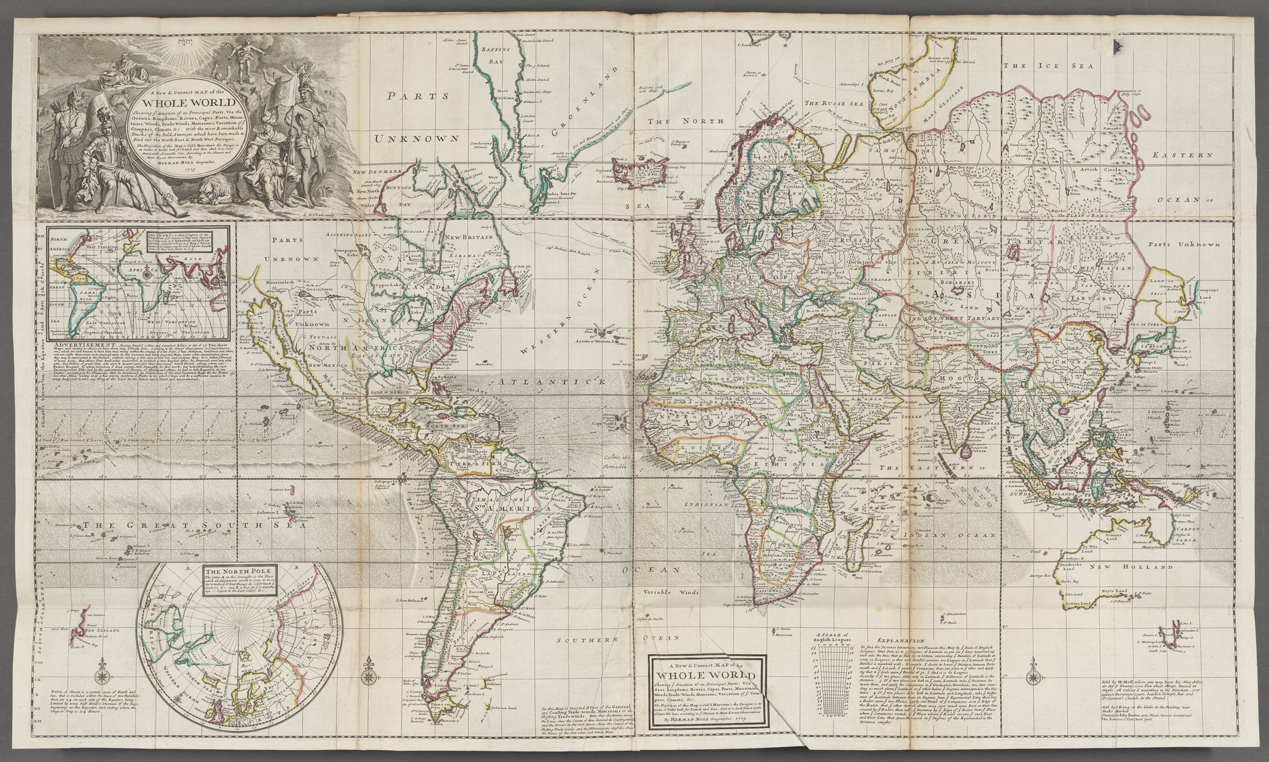
The story of this strange cocktail inspired many of the design choices. The first of these choices was the found imagery used throughout the branding. The landscapes and portraits are archival photos around the Yukon area.


The primary wordmark is an adapted version of the the typeface “metalista.” This founts angular forms and edgier tones felt right at home given the themes of mummified toes and gold rushing. The red labels provide a pop of color, while serving as a secondary element of the branding. This secondary label is an element that could be applied across merchandise, social media, or web as an immediate signifier of the Sourtoe branding.